Written by: Vickie Sullivan | July 10, 2018
How to Use Graphics to Explain Complex Subjects at a Glance
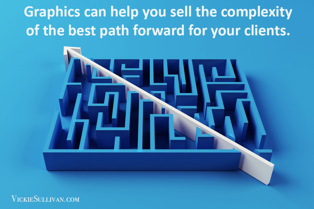
A lot of us use models to explain our approach. We break out our trusty double-axis to diagnose and frame a problem. But too many of us miss the opportunity to sell the complexity of the best path forward. Graphics can do that.
A great example is consulting giant Bain & Company’s pyramid of 40 distinct kinds of value defined by business-to-business (B2B) customers. (You’ll find it on page 6 of this Harvard Business Review article (pdf).) Why this works:
• It heads off the “we already know this” problem at the pass. Yep, we already know that emotions play a role in decisions. What we didn’t have is all 40 of them in one place.
• It facilitates deeper thinking. This graphic gets the reader out of the 30,000-foot view and drills down into diagnosing what works in our situation. It forces us to think about which levers to flip. That thinking adds value.
Listen: 2 things that Bain’s visual conveys (that you can’t)
Graphics like Bain’s sends the message that implementation is never as simple as it seems. And isn’t that what we want to convey when offering help? The next time you have to explain a bunch of moving parts, take a page out of Bain’s playbook.
You May Also Be Interested In:
- Your Story as an Infographic
- Strategic Sounding Boards Give real-World Advice for When the Rubber Meets the Road